Wednesday, February 22, 2023

Free Template Tool for Getting Your Zazzle Coffee Mug on a Transparent Background

With the importance Zazzle has placed on Cover Photos, we've all been struggling to make our own in a hurry. While Zazzle has conveniently provided us the options to download our artwork or download a product mockup view, the product mockups are not on a transparent background. A transparent background is necessary for inserting your product view into your own unique Cover image, but making it transparent is a challenge and even for those with the skill to do it, very time consuming.

Coffee mugs are a super popular item on Zazzle but because of the way the design area is, it's one of the products where the artwork download doesn't cut it - you really need the Product Mockup view. So I dusted off my Photoshop skills and made a template file that can be used to turn your downloaded Product Mockup into one with a transparent background, in just a few clicks and with no skills required. There's a link to download my .psd file at the end of this post. I made it in Photoshop CC 2019 and my instructions reflect that; if you're using another version your menu options may be different but you should still be able to find your way along.

I made this template for the Left and Right views of the 11oz Combo Mug but it also works with the Classic Mug.

So here we go. First thing is you need to download the Product Mockup of your mug from Zazzle. Go to the product page, chose the Left or Right view, and then click "More Options" from the top menu bar. Then click "Download Product Mockup".

This downloads a 2048 x 2048 image to your computer. You can rename the image but otherwise don't alter it any way. Now open my .psd template. You'll see this by default:
Looks crazy but don't worry, you can toggle element groups on/off from the Layers panel:
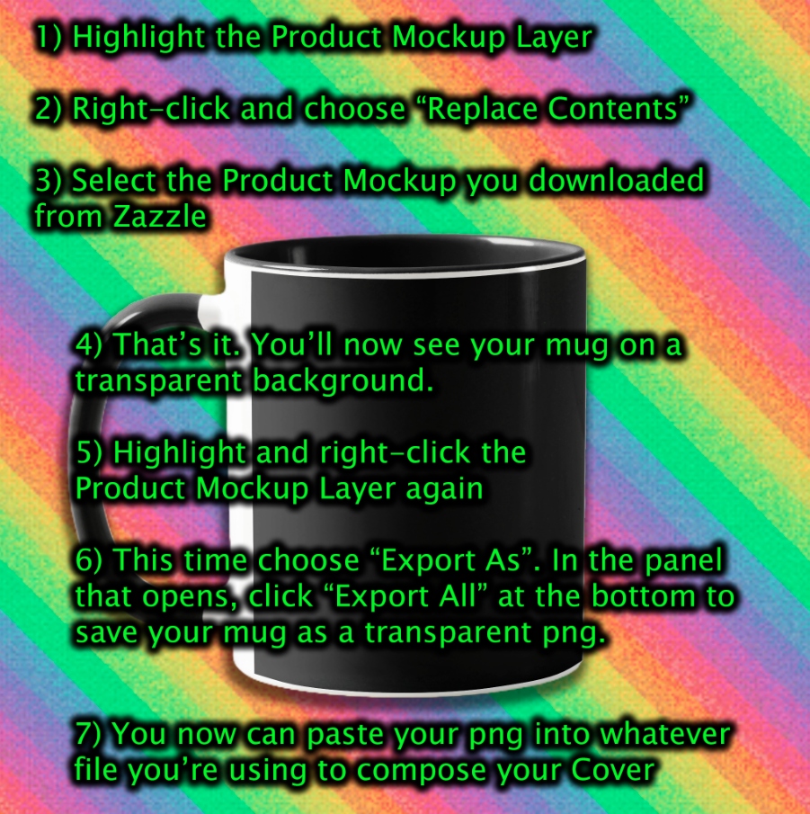
If you've downloaded the Right view, toggle the Left group off and the Right group view on and click the little arrow to open the group. Highlight the "Right Product Mockup" layer, right-click, and choose "Replace Contents".
This opens a Browse panel to select a file from your computer. Select the product mockup image you downloaded from Zazzle.
That's all there is to it! You'll now see your mug on a transparent background. To save your mug image on the transparent back, highlight the "Right Product Mockup" layer again, right-click, and this time choose "Export As".
In the panel that opens, click "Export All" from the bottom and your mug, now magically on a transparent background, will be saved to your computer as its own image file. You can now use this image in whatever file you are working on to create your own unique mockup. Best thing is that you can do "Replace Contents" and "Export As" over and over and over without messing up the template. So you can use this one template to transparentize all of your mugs, Left and Right views.

Now, once you've Replaced Content to insert your own mug, you can continue editing and creating your final Cover in this file instead of exporting but I wouldn't recommend it as you could easily overwrite the working template for transparentizing. But if you do want to do this, here's what to know:

Use the Background layer group to insert your own content.
Use the Mug Mask layer to add drop shadowing to the mug.
Use the Product Mockup layer to edit mug colors.
Note that the Mug Mask and Product Mockup layers are linked so you can re-size and/or move the mug around the canvas, and still use the Replace Contents option after doing so as often as you want to insert different mug designs into the same mockup scene you've created. So if you want to do 50 Covers of mugs that are all the same except for the actual mug design, you can do that with this template, you just have to be sure not to overwrite your master-copy. And always when starting a new project, use the original 2028 x 2028 download from Zazzle with this template.

A few more notes: I have an example Drop Shadow layer effect applied to the Mug Mask layer. You should toggle this off or use Clear Layer Style to remove it altogether. Just be sure that it is not on when you do "Export As" or the drop shadow will be included in the exported image. I recommend that you always export a "clean" image, no shadowing applied, so that you can import/paste it into whatever other file you are editing it in and create your needed shadowing there after it's in place.

Here's the link to download the file from my website:
https://colscreations.com/SharedFiles/ZazzleTemplates/Templates-Mug-11oz.psd

This is totally free to download and use for creating your Zazzle Cover Images. Please do not re-distribute the file. If you want to share it with someone please instead direct them to this blog page where they can download it directly. No attribution is required but if you find this helpful, I do ask that in return you please promote something from my shop. Thank You!


Tuesday, March 9, 2021

Artist Spotlight: Rebecca Wang

In my time designing for my print-on-demand (POD) stores I have discovered some truly talented artists with unique styles that also speak to my personal penchant for the bright & colorful. (Life is not meant to be lived in black & white!) I discovered the art of Rebecca Wang some time ago while browsing Zazzle.com in search of a fishing related gift for my husband and coming aross this:
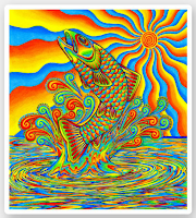
Rainbow Trout Collection How cool is that?! So fun and vibrant and full of energy! A little more browsing and I discovered that Rebecca has a large portfolio of equally amazing art featuring a menagerie of lively psychedelic animals. Rebecca works primarily with acrylic paint and colored pencil to create her unique works which, through some digital magic, she offers on a vast array of print-on-demand products in her on-line store.
Here are a couple more of my favorites:
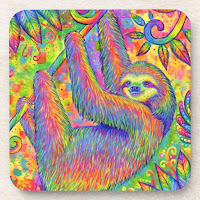
Cool Chameleon Collection Electric Gecko Collection Psychedelic Sloth Collection Paisley Peacock Collection
Clicking on any of the above images will take you to Rebecca's collection of products featuring that design. Did you look? Awesome, right? Imagine how amazing that cool psychedelic chameleon would look on an accent pillow in your sun room ...
But wait ... there's more!
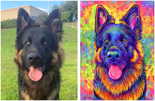
Rebecca specializes in painting custom pet portraits on commission. Using a photo of your beloved fur baby for reference, she will paint a portrait that not only magically allows your pet's distinct personality to shine through but also incorporates her signature style.
colorful cat portrait colorful dog portrait Click here for detailed information on ordering a custom portrait of your pet from Rebecca Wang. Be it a dog, cat, lizard, gerbil or even sheep, she'll create a work you will treasure forever.
* If you follow any of the links here that lead to zazzle.com and purchase something, I might receive a small commission. While this is nice for me if it happens, it's not a factor in who/what I choose to blog about. If I spotlight someone it's because I truly admire their work and want others to discover them too.

Sunday, September 15, 2019

My Latest Endeavor - Zazzle


Sooo, I've opened a shop on Zazzle.
Zazzle is a print-on-demand company that puts my unique designs on their products which can then be further customized by you with your own text and pictures. My colorful one-of-a-kind designs are available on home decor products, office supplies, stationary and more!

I have ordered many things from Zazzle myself, from cards to coasters to pillows to t-shirts, and the print job is always super. Zazzle offers "We promise 100% satisfaction. If you don't absolutely love it, we'll take it back" and they mean it! Their customer service is outstanding.
Their sales change about twice week so check back often, and think about signing up for Zazzle Black to avoid shipping charges.

You can browse my selection here and if for some reason that link is "down" you can go directly to my store here instead. Thanks for visiting, I hope you enjoy looking around!

Tuesday, May 23, 2017

Resurrection

So wow, three years since I have written on my blog. I think it's time to resurrect it. And keeping with the theme of old things being new again, I'll start off with an old rocking chair I gave new life to :)

This chair was originally a curbside find by my MIL, who saw it out for trash many years ago and dragged it home because it still looked like a decent piece then. I sort of inherited it when we moved into our current domicile, where it's lived outdoors on the patio, getting more weathered with each passing season. I personally find it a bit uncomfortable to sit in - those slats are hard on the back - but its my Other-Half's favorite chair so past its prime or not, getting rid of it was not an option.

Last summer I happened to stop in a Pier1 that unknown to me was going out of business so had some really great mark-downs going on, including outdoor cushions marked down from $40 to $9.99. When I saw this one I knew what I had to do:


I had to buy that cushion and paint up the old rocking chair to match!

So off to the hardware store I went to pick out matching spray paint colors. For the blue and orange I bought Rust-Oleum's "Painter's Touch 2X Ultra Cover Paint + Primer" which I had used before with great results. No drips, no runs, excellent coverage. For the green, Rust-Oleum didn't have anything close enough to what I needed so I got that in Krylon's "Dual Paint + Primer". Then I set to it, doing the blue first. When that dried I wrapped all the parts of the chair I didn't want to get more paint on in Saran-Wrap, secured the wrap with painters tape, and sprayed on the orange. Looking pretty good so far!


Then I did the green (after covering all the blue and orange parts with Saran-Wrap) and oh bummer. Krylon's spray was disappointing. Must be a thinner product than Rust-Oleums's because it ran and dripped, and the nozzle produced a wider "arc" of spray than desirable so things got messy fast. But after numerous touch-ups and a second round of wrapping & spraying to get a second coat of each color on, I'm pretty pleased with the results. (Though I will stick with Rust-Oleum from now on.)


(Don't look TOO close or you'll see the errant spot of orange I still need to touch-up.)

It looks great sitting on the patio now and people always ask how I found a cushion that matches it so perfectly. ;)


Saturday, May 17, 2014

The $65 Flop

Back in June of 2012 I went back to Illinois to visit and while there went to a paint-your-own-pottery place with my Mom, Sister, and Niece. For those not familiar, paint-your-own-pottery places (PYOPP) work like this: You walk in - no reservations necessary - pick out a piece of over-priced greenware, pay the studio day fee, and paint your piece using the paint, brushes, and misc. supplies provided by the studio. The PYOPP dip-glazes and fires the piece and a week later, you go back and pick up your finished masterpiece.

So the four of us went and it was a lovely day, three generations together, puttering with paint. I however apparently did more puttering then painting as at the end of our studio session my bowl was not finished. Niece was also not finished (she was doing a rather detailed design though) so we all went back again the next day for a few hours so that the two of us could finish our designs. And though Niece completed her piece, I did not. I had decided on doing a stained-glass look, a ridiculous choice of design given the time factor. So while the other three pieces stayed at the PYOPP to be glazed and fired, my bowl left with me, to be finished later back in Pennsylvania.

The day before I boarded the plane back to PA, we returned to the PYOPP to pick up the three finished pieces. They looked fantastic! The difference in colors between the raw ceramic paint and the fired paint is amazing! I was bummed I didn't finish my bowl in time but knew there was a ceramics store in my hometown that would have the paint and kiln needed to finish it. Not wanting to risk my bowl breaking on the plane, Mom went to the trouble of having it securely packed & mailed back to me. (Thanks, Mom!).

My bowl and I back home in Pennsylvania, I made my way into the ceramics store downtown. This is a "real" ceramics store. They sell greenware and painting supplies and offer the occasional class. They are not a PYOPP. The two ladies working there when I went in were a bit condescending and quite a bit anti-PYOPP. They did not carry the brand of paint I needed to match what I already had on the bowl, and every time I picked a close-enough color from their sample board they told me "Sorry, we are out of stock on that color". I finally picked out four in-stock colors that were a pretty good match, plus a black, and left, silently vowing never to go back to that store.

This was the same summer we moved from an apartment in town to a house on the river. Grateful, blessed, lucky - yes! But also - BUSY! Moving ain't easy. ;)
As time and circumstance allowed, I finally finished painting the bowl. All that was left to do was to get it glazed and fired ...
As I did not want to go back to the ceramics store downtown I was keeping my eyes open for a PYOPP. Somwhere that would adopt my bowl and dip & fire it with the rest of their batch. When I finally happened on such a place, on the way home from a job, they were in the process of changing locations. The owner was very nice, told me sure, we'll do it for you, but wait 'til next week until we are in our new location ... The next week we of course were not working in that area so by the time I was able to get to the new location, with the bowl, months had passed. And the store was closed early for the day. Sigh.

Many more months later, we have another job in that area so I bring the bowl with me. I am going to drop this damn thing off today no matter what!
The lady working that day was very nice, said she had a batch going in the kiln that night so she would dip my bowl right away and get it in that batch.
Two days later she called and said it was ready for pick-up. But due to job rescheduling, it was two weeks before I was able to return to the store to pick it up.

When I returned to pick it up, my bowl was a beacon, calling to me from its shelf, a stand-out amid all the other less vibrantly colored pieces. I was ecstatic. Look at how the colors came out! So not only did I happily pay their small studio fee for glazing & firing the bowl, I also picked out a matching raw mug. I figured I could paint it with the paint I had left over from the bowl and have them fire it. But I hadn't really LOOKED at the bowl yet. It wasn't until I was back in the work van on the way home that I unwrapped it and really inspected it. Oh dear!!! What a mess!!

Here is what my bowl looked like before I dropped it off to be glazed and fired:


And here is what it looked like when I picked it up after glazing and firing:


OMG!! It looks likes a kindergartner did it! Horrible! Not only did the black lines bleed out, the glaze was bubbled and blistered all over.


After I got home I did some research and found numerous reasons for glaze bubbling/blistering. Contaminates in the glaze, glaze not mixed thoroughly, glaze is applied too heavily, glaze itself is too thick, dirty kiln, improper heating/cooling ...
All of which point to the store's procedures and not me. I was not a happy camper at this point. A lot of time and expense went into this piece and now it is ruined. Aside from the black bleeding out and making it look like crap, it also feels bad to the touch.

Two days later I took it back to the PYOPP wanting some answers. I had with me "before" pictures - what it looked like before the tidy black lines I slaved over ran amok. The woman who happened to be working that day was very nice but was also rather nonchalant and unsympathetic. She said it appeared that 1) there were contaminates in the glaze making it bubble/blister and 2) their glaze must have reacted negatively to the paint I used causing the black to bleed.
She did say she could try to sand down the blisters and reglaze / refire the bowl which was a nice offer but since the bowl was still a disaster because of the black bleeding it wasn't worth the effort so I told her no thank you. I then returned the matching mug I had bought (was not going to waste time painting it if I couldn't trust them to finish it without ruining it) and got the $6 back they charged for dipping and firing it.

I thought, to be able to paint a piece at home and then bring it to them and have them glaze and fire it for only $6 (their studio fee for day) - what a good deal! But not if they are going to ruin it in the process. So I think my ceramic painting days are over.

All that said ... I think PYOPP are a great idea and loads of fun - as long as you paint there with their supplies. If you do it on your own and bring it to them just for the finishing the outcome is risky and they won't stand behind it.

And oh .. if you tally up the cost of the greenware bowl, the two days of studio fees in Illinois, the packing and shipping to PA, the cost of paint for me to finish it on my own, and the fee at the PYOPP place here in PA, this bowl has $65 in to it. Minus the $6 they refunded me. So that makes it "only" a $59 bowl. Lesson learned. ;)

Sunday, May 4, 2014

Decoupaged Camo Dresser

When we switched a few years back from a Dodge cargo van to a Chevy cargo van, we needed something up front that would serve as a table/desk top and also provide extra storage. After scouring the thrift stores we found a little 4-drawer night-stand that was the perfect size for our needs. It fits snugly between the seats and is just the right height to serve as a desk top and dining table. (Yes, we eat many meals "on the go".)
When Spring hit this year (finally!!) I decided the butcher-block like top needed a sprucing up. I was just going to sand it and apply a new coat of wood stain and sealer but alas! When I took the orbital sander to it I discovered it wasn't actually solid wood. Having wrecked it with the sander and not being able to just stain & seal it as planned, I needed another finish that would be durable and easy to wipe clean, which ruled out simply painting it.

I knew from experience that Mod-Podge Hard Coat topped off with Folk Art Extra Thick Glaze makes for a pretty durable finish so like any sensible person would, I decided on decoupage. ;)
I knew my usual bright "Col Colors" would be out of place in the work van and thus wouldn't sit well with the Other-Half so I went with camoflauge as I already had camo patterned napkins on hand. And because I didn't think that would be hard enough I decided to place a rustic fishing scene in the center using another napkin pattern I had. (I tend to collect decorative paper napkins same way I do ribbons and beads; you just never know when that design will come in handy. ;) )

Decoupage with napkins is tricky because they tear so easily, especially after becoming damp with the glue. And I am here to tell you, if you want a perfectly smooth wrinkle-free surface this is not for you. You WILL have wrinkles if you are using paper napkins or tissue paper. (The fine wrinkling, however, mimics a crackle effect when all is said & done so if you are after a weathered/antique look, then by all means, use napkins!)
Napkins usually are two-ply: a top patterned layer and a bottom white layer. To decoupage with them you MUST separate the plies so you have just the patterned layer to work with. Separating these layers is a bit tedious but not all that hard. You just have to get a corner started and gently pull apart.
Having separated my camo plies I completed the camo border without much mishap. The trouble came when I applied the center napkin scene. It was bubbling up terribly and just not sticking. On closer inspection I realized, shoot! there is a third, very thin white ply in there I hadn't noticed. A rare three-ply napkin! :( So I had to scrape it all back off, ruining my camo border in the process, and start again after tediously separating that extra middle ply from the patterned one.
Applying a 13" x 13" napkin in one uncut piece without tearing it was more than I should have asked of myself but I went slowly and just as I thought, "Ha! Victory is mine!", yep, I tore a hole in it. :( And right smack-dab in the center of the scene. $%#@&! Using another napkin, I patched the dime-sized hole. I knew that where the patch overlapped the original layer it would be darker but I thought it would blend in. Boy was I wrong! The patched area stood out like a sore thumb. :(
At this point the Other-Half got involved. He was very much liking the new look of our van table so was as distraught as I was over the ugly dark spot now in the center of it. I was done though. I was not going to scrape it all off and start over from scratch nor was I going to attempt to excise the blighted area and re-patch. So as I nervously watched, he used a straight edge razor and a chisel to cut out a rectangular area, quite a bit larger then the blemish, from the table top, miraculously not marring any of the rest of it! He then cut a matching rectangle from another napkin and I glued it in. Ta-Dah!!! You can see the rectangular outline of the patch if looking from an angle, but overall it is WAY better than the dam dark spot from the first patch job was.
We then went on to add camo to the handles, orange paint to the drawer interiors (why not?) and black edging, followed by a fresh coat of white paint on the back, sides, and drawer fronts.
It ate up more time than I had planned on and will be seen by few as it's only going in the work van, but, I think it was worth it. Turned out to be a pretty cool little dresser. :)

*** Note about the Folk Art Extra Thick Glaze.
The product link above says it produces a "subtle" glossy sheen. ROTFL!! This stuff makes an insanely glossy glass-like shine when applied in multiple layers. I love it! (Drawback though is trying to photograph something it has been applied to.)

Friday, June 28, 2013

Maloccio Bracelet


I got the idea for this linked stretchy bracelet from one I bought from Sears (uh, yes, Sears!)a while back. I thought the design would be easy to copy. 80 beads and 144 links later I ended up with something that looks nothing like the "inspiration piece". But that's how it should be right? Not to copy a piece but to use the idea and make something unique out if it.


I made 16 nine-link segments, then used stretchy cord to thread on my glass beads, alternating evil-eye and spiral patterns. After stringing the five rows of beads, I tied off the ten loose ends, dabbed the knots with hypo cement, and done. Which is really over-simplifying. I had one issue after another making this, ending with gluing the B and SpaceBar keys together on my keyboard with the hypo cement. (TIP: Don't manhandle tubes of glue near your computer.)


It makes for a rather heavy (80 glass beads tend to weigh a lot) and wide bracelet, but I like that. With the chain links running one way and the stretchy cord running the other, you can wear it scrunched up, or, stretch it out some on your wrist to make it even wider. I like that, too. But you could easily change the size and number of links and beads in this design to make the finished bracelet larger/smaller.

Thursday, February 21, 2013

A Couple More Tie-Dyes

For this V-neck tee I used two colors, Magenta and Purple, diluted to various strengths to get various shades. The purple, at its darkest, appears almost black, but it really is purple. I tried to center the start of the spiral on the point of the V-neck, letting the rest of the pattern end up as it may.
I used just two colors on this one, too, Lime and Blue, again diluting to various strengths to get varying shades. For this, I purposefully left white spacing between the colors as I didn't want the blues and greens bleeding together too much.
The "Left Overs" shirt; because no matter how you plan, there is always, always, dye left over and tossing it haphazardly on whatever odd cotton garment you find in the recesses of your closet is more fun then simply tossing the dye. :)
My Left-Overs are never planned, they are just the result of aimlessly tossing extra dye on a garment I can spare if it turns out gruesome. With this Left-Over, however, I accidentally invented a new "technique" that I can, in the future, perfect and use on purpose.
For this technique, your dye colors need to all be in the same color family so that when they bleed together you get pleasing intermediary colors and not mud. (This shirt had various strengths of Magenta, Purple and Blue applied to it.) Get your garment really wet, not dripping but much wetter than you would want if trying to dye a pattern. Lay the garment out flat but with nice wrinkles and squirt the dye colors on heavily, in a random, overlapping way. You want to thoroughly cover the shirt. Once covered, ball the garment up and squish and twist it, unballing and re-squishing several times, forcing the colors to blend and bleed and do what they may. (If the shirt is not wet enough you won't get enough bleed action.) Leave balled up and wrap & wait as normal before rinsing. If successful, your finished garment will be a grandly muddled melange of complimentary colors.
This Left-Over shirt pictured appears to have definite "lines" in it but in real life, they are not obvious. Except for on the sleeve, they weren't even noticeable until looking at the picture. I think the flash highlighted them. Anyhows, "lines" aren't good! So (note to self) to avoid them altogether, make sure the entire garment is good and wet, and don't use a narrow tipped squirt bottle to apply the dye.

Tuesday, December 11, 2012

Vintage Fan Make-Over

This old non-working Dominion fan was destined for the scrap heap but look at it now. How cool is that?! The Other-Half tinkered with the motor and was able to get it running, and run it does! Sounds like a jet engine on start up but then quiets down to a smooth purr. Just as it did 60 years ago. This heavy-duty little thing (it stands about 12" high) really moves some air, too. Dare I sound like an old fart and say "they just don't make things like they used to"?

After he got it running it was disassembled again and I went at it with a wire brush, some scuff pads, and some rust-removing gel. Cleaned it up inside and out, sprayed it all with a primer, sanded it smooth, and there ya' go - ready for a nice top coat.
We weren't 100% in agreement on what colors we wanted but settled on bright orange. I think the orange helps retain a bit of the "retro feel", plus, orange and black happen to be the colors of the Philadelphia Flyers, our favorite NHL team. (Big boo on the NHL for canceling hockey this year.) So now we're Flyers fans with a Flyer fan. Something like that, LOL.

Here's a page from a 1953 catalog that has our fan listed for $12.95. That's how I know to call it "vintage" rather than "antique". Apparently antique is pre-1950 and vintage is post-1950. Anyhows, we just need to touch up the six screw heads that show with black paint, and maybe uncover the Dominion logo on the base that we protected with tape and viola, what was junk before is now an adorable and functional retro appliance. :)

Sunday, September 30, 2012

A Classic in Tie-Dye

Take the classic white long-sleeved button-down shirt, a staple of every wardrobe for its versatility, and tie-dye it, and what do you get?
You get a fabulously fun addition to your wardrobe!

Wear it buttoned up and tucked in to create a fun fashion paradox of staid but exciting, or go all-out casual by wearing it open over a tank.

The sleeves have a hidden loop that allow you to roll them up and fasten at 3/4 length so you can go long or short depending on mood.


The side panels (from under-arm to bottom hem of shirt) are made up of a stretchy ribbed cotton, so this shirt moves with you.

This shirt is 100% cotton and has been machine washed & dried twice (pre and post dye) on high heat. It is labeled as a women's size XL (16-18), however, having tried it on I believe it is more inline with being an L. This shirt can be machine washed and dried and should not bleed but to be safe, you may want to wash with dark colors for the first few washes.

$35, free shipping. (black tank top pictured not included.)